The solar PV plague in pictures
A lot of people have got carried away with the idea that solar PV will proliferate like a rabbit plague eating away the entire profits of incumbent electricity industry.
They've probably got carried away.
But you can understand the excitement when you look at the maps below, prepared by ACIL-Allen Consulting for the Australian Renewable Energy Agency.
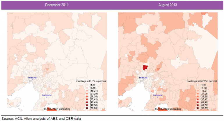
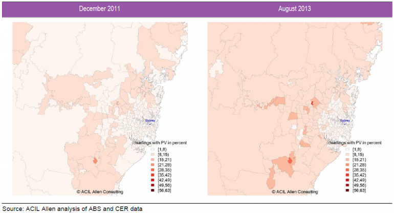
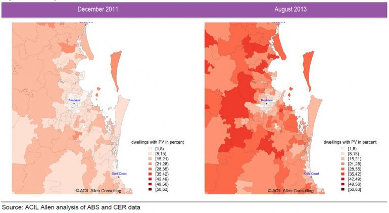
These maps chart the proportion of dwellings with solar PV in December 2011 and then August 2013 for Melbourne, Sydney and Brisbane. Areas of white (indicating solar PV for under 8 per cent of dwellings) in regional areas surrounding these cities have disappeared and all areas other than inner suburbs have turned 'redder'. It’s like these cities have been surrounded by a swarm of solar uptake with just the inner urban areas managing to hold back against the plague. And in the case of Brisbane, the swarm has now penetrated deep into the city.
Melbourne proportion of dwellings with solar PV systems

Sydney proportion of dwellings with solar PV systems

Brisbane proportion of dwellings with solar PV systems

By the way, the area surrounding Adelaide looks similar to Brisbane but it already had high penetration by December 2011.
This belief of solar’s inevitable takeover is understandable, especially if you thought Brisbane reflected the future of every other Australian city.
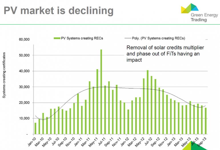
But sales of solar PV across the nation have dropped away in recent times. And the Brisbane story was heavily influenced by a rush to take advantage of the state government’s 44 cent feed-in tariff before it was withdrawn. This opportunity won’t repeat itself in other states.
The chart below from a presentation given by Ric Brazzale of Green Energy Markets, illustrates that 2013 has not had the surge of sales around the middle of the year that we’ve seen in 2011 and 2012. According to Brazzale the mood within the market is that sales of solar systems have got much harder.

Source: Ric Brazzale (2013) All Energy Conference 10 October 2013, Markets and Price Outlook – STCs, VEECs and ESCs
This is reflected in the market for the solar rebate certificates, known as ‘STCs’. Electricity retailers are obliged to buy these STCs up to a cap of $40 to meet an annual target set by the government. The closer the price of STCs is to $40, then the more difficult the solar industry is finding it to meet the target.
For the past few weeks the price of STCs has been hovering around $39.
The market is still on track for around 700 megawatts this year (the size of the last coal power station built on the eastern seaboard), so there’s no going back to the dinky days where solar was little more than a green trinket.
But, looking forward, repeating what occurred with Brisbane will be much tougher going.


