The most common misleading indicators for property prices


Summary: Investors should understand the information analysts use to make predictions about the growth of Australian property markets – not all methods give reliable information. It's often assumed that the volume of property sales is a key indicator of rising prices, but this isn't actually the case, while supply levels are often left out of the equation entirely. |
Key take out: By understanding what indicators work and which can be misleading, investors can more reliably make their own predictions about movements in their local property market. |
Key beneficiaries: General investors. Category: Property. |
The property market is littered with predictions from analysts and commentators that turn out to be hopelessly wrong. Virtually every expert tipped Brisbane to be the boom property market of 2015, but to name or shame them would spoil the fun, because we love hearing predictions even when they flop. That is, unless we get burnt ourselves by a failed forecast! To avoid this, we need to look at what information experts rely on to make their predictions so that we can see why they succeed or fail. If we understand what's behind the data commonly put forward to make predictions, we can unravel the mysteries of the market and also come to our own conclusions about the likely performance of any housing market.
Price ripples to predict growth
Most market analysts consider the ripple effect as a given. You only have to look at how the ripples move out from the centre of a pond when you throw in a stone to see how it works. In similar fashion, it seems that housing prices move like a wave of growth that spreads from inner to outlying suburbs, rippling out from dearer areas to more affordable locations. The theory is easy to understand and was one of the most common reasons experts put forward to predict Brisbane's long-expected housing market boom in 2015, making statements such as: “The gap between Brisbane prices and Sydney prices is a solid indicator of growth potential.”
The main reason why this prediction failed is because the ripple effect is just that – an effect, not a cause; price growth won't occur in areas where a rise in sales doesn't also lead to stock shortages. In other words, although sales rose in Brisbane during the last year, there was sufficient housing stock available to meet the rise in demand and so there was no price boom. Figure 1 shows the housing stock situation in each state and territory at the end of 2015 and illustrates that Sydney's housing market has been experiencing high price growth because of its overall shortage of housing stock, while lower growth has been occurring in Melbourne with little to no overall growth in other states and territories.
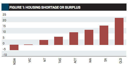
The large stock surpluses in some of the states shown in Figure 1 could lead to price falls in the areas where they're most pronounced, but we need to be careful with such sweeping statements because there may also still be pockets with shortages of some types of housing stock in those states. What the data does show us is that there won't be a ripple effect in Queensland, South Australia or Western Australia leading to overall price growth until, and unless, the existing stock surpluses in those states have significantly diminished.
The “odd man out” misleads
Some experts were claiming that Brisbane was overdue for growth purely because of its comparative lack of growth in recent years: “Brisbane is the only capital not to have experienced a substantial lift since the GFC.” This is known as the “odd man out” theory, which states that if every other market has gone up in price, the last one will surely follow. It's different to the ripple theory, which claims that prices ripple out from the market leader, because the odd man out theory refers to the last market to rise, not the second or third. The issue with this misuse of data isn't just about which years you use, but about which data you employ to find the odd man out.
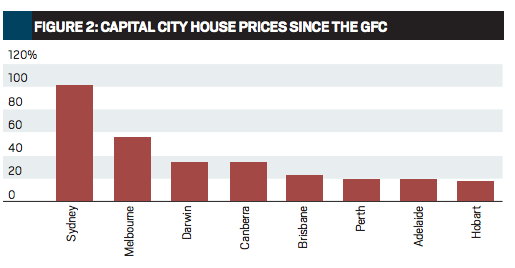
For example, in Figure 2 I've used official ABS housing stats to provide the actual rate of price change since the GFC. They show that Brisbane has achieved a lift in the median house price of 24 per cent since 2008 and while this isn't huge, Brisbane isn't the odd man out at all, with Perth, Adelaide and Hobart all achieving lower growth.
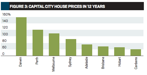
Can we now use this logic to claim that instead of Brisbane it should be Perth, Adelaide or Hobart that's due to boom? Not really, because the ranking changes according to which period of time is used. Housing prices in Australia as a whole have doubled over the past 12 years, so we could logically compare the performance of each capital city's house market over that time. Figure 3 shows the total growth that has occurred in each capital city over the past 12 years and reveals that Darwin, Perth and Melbourne were the only cities to achieve more than a doubling of prices in that time, with Hobart and Canberra struggling on less than 70 per cent growth. No one is seriously suggesting that these will be the next house markets to take off, but they could be. The odd man out theory won't tell you, because the rankings change over time.
The past can't predict the future where housing markets are concerned. It won't indicate which city will be the next to boom and, as Figure 3 also shows, Sydney's recent high price growth still leaves it behind Melbourne with regard to comparative performance over the past 12 years. All that past performance can tell us is that growth tends to even out if we wait long enough, which is no way to find the next boom market.
Sales volumes don't predict growth
In any type of market, be it shares, commodities or even our local produce market, we can see that when demand rises, prices tend to follow. This has led to the notion that housing sales volumes are related to price movements, with rising sales indicating that prices may soon follow. But do they? Figure 4 compares changes in the numbers of houses sold in the past year in every capital city to the price changes that took place over the same time.
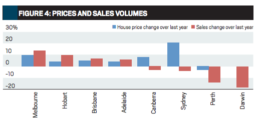
Figure 4 shows that while Sydney had the highest price growth in 2015, the number of sales fell and although Melbourne experienced the biggest rise in sales the increase in house prices there was less than Sydney. Perth suffered a drop in sales and a fall in the median house price, but Darwin had the largest percentage fall in sales and prices didn't crash, in fact they didn't fall at all. It could be argued that there is some correlation, but it's far too inconsistent to be a reliable indicator of future performance and it would take a brave analyst to predict a fall in Sydney prices based purely on the fall in sales volumes occurring there, or a rise in Melbourne's house prices due to the growth in sales over the past year. If price prediction is an equation with price changes on one side, there needs to be more information than just sales on the other, because they only tell us about changes in demand.
Supply is the missing indicator
To make any prediction of potential price changes, we need to compare supply with demand. We did this in Figure 1 by comparing the total supply of new housing to the number of new households in each state and estimating whether there's an overall shortage or surplus of properties. A top-down approach estimates the total demand for housing generated by new households and compares this to the total number of new dwellings approved for construction. By looking at how such a housing shortage or surplus is trending in each city or state we can form an idea of how the total market is likely to behave, as Figure 5 does for NSW.
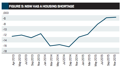
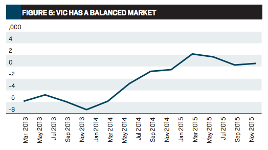
We can see that NSW has had a substantial shortage of housing for several years, which eased in the past 12 months. This is what directly led to the housing price boom in Sydney and the data also indicates that the shortage has diminished, so that overall price growth is likely to slow down. In Figure 6 the same comparison between supply and demand in Victoria shows that the trend has been moving the other way to NSW since early 2015, but while the demand for housing throughout the state continues to rise and stands at record levels, the supply of new housing is still not matching the pace, suggesting that overall price growth will continue
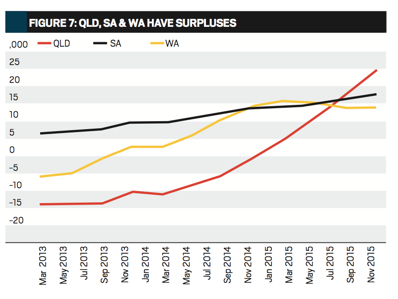
As Figure 7 shows, all the remaining mainland state housing markets have stock surpluses and these are rising in Queensland and South Australia. The oversupplies in these states are a result of the mining industry slowdowns, which has left many housing markets in mining towns and ports overdeveloped and overinvested and has also forced many of the construction workers in those towns to move back to the capital cities, where they're now actively involved in housing construction. While this type of macro analysis can reveal the potential for overall price changes in a state or capital city, it has a huge drawback, because it can't tell us which types of housing will be in the greatest demand or where, or which areas will still have shortages and growth potential even in markets with general stock surpluses. As interesting as it might be to predict the next boom city, we don't buy a whole city, we buy a property in a suburb, so how can we measure the shortage or surplus at suburb level?
How to predict suburb price changes
While estimating total household growth compared to new housing construction gives us a bird's eye view of each market, it doesn't enable us to drill down into suburbs to view the situation there because the data is simply not available. We need to use other supply and demand measures, which are available at suburb level to read their markets. Luckily, this information is freely available – we simply look up the suburb's annual sales for houses or units in the Databank at the back of your Australian Property Investor magazine and then compare this figure to the number of current online listings for house or units for sale in that suburb. Figure 8 shows you the five types of housing markets that this analysis reveals.
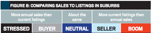
Stressed and buyer suburbs tend to have falling prices and it's going to take a large movement of new households into the suburb to take up the surplus before any price rise can occur. In stressed markets this could take years. During all this time, housing prices will probably continue to fall, so that any future rise first needs to claw back previous losses. The bigger the ratio of current listings to annual sales, the longer this will take. On the other hand, if your selected suburb is a seller or boom market, prices are already rising because there are stock shortages and the only question is whether you can find a property that meets your investment criteria, is priced at fair market value and whether the demand will continue to outpace supply so that prices will rise. Neutral markets usually have little to no price movements, so the right time to buy is in a buyer or neutral suburb, which is trending into potential price growth, and the best time to sell is in a seller suburb, which is trending towards a neutral market.
You can pick the trend in any suburb if you do the analysis every month and build up a series of snapshots of the same suburb over time. Using trends to predict the future is one of the most accurate forecasting methods there is, because they tell you which way the market is moving – so that you make your own predictions. Now you can ignore those misused and misleading numbers and make use of the ones that give you a reliable indication of which way prices are likely to move.
John Lindeman is director of innovative housing market analysts Property Power Partners. For more information visit understandproperty.com.au
* This report originally appeared in Australian Property Investor and is republished with permission. See http://www.apimagazine.com.au/


